PRODUCT DESIGN CASE STUDY
Survey Management Platform Design
Designing the operational core of a market-research company
SUMMARY: Edge was the name give to the internal platform that ran InnovateMR. It managed the entire life of a survey, from the moment a job was created to the moment a panelist got paid: building jobs and groups, wiring up routing and API connections, setting quotas and pricing, organizing traffic across our own panel and outside sources, collecting results, handing them to the client for acceptance, and closing everything out. Early on, the company ran its survey traffic almost entirely on a third-party platform, but paying to use someone else’s system to do the core thing the business did was never going to scale. Edge was how we replaced it.I designed the entire interface and experience, working from the founder’s concepts and alongside our operations staff and a remote development team. By my third year it had taken over, and we were off third-party systems for good.
POSITION: VP of Product Development, InnovateMR
The Problem
InnovateMR had two problems stacked on top of each other, a business problem and the other a design problem.
The business problem was simple, InnovateMR was running its survey operation largely on a third-party platform it paid to use, and you cannot build a company on rented infrastructure for a significant part of what you do. Matt Dusig and Gregg Lavin knew we needed build out a more robust system. That was the decision behind creating Edge.
The design problem was the hard part. A survey operation generates a staggering amount of data per job, with building nested quotas, analyzing incidence, establishing pricing, routing survey links, tracking completes and terminations, and managing traffic sources, and all while all of it changes live while a survey is in the field. And it was never one person looking at it. Project managers, account managers, sales staff, even the accountants each lived in different parts of the same system.
The challenge was not building screens that could hold all that data. It was building screens where a trained PM could glance at a survey and know, instantly, how it was doing, compare it against the group beside it, and drill into the exact control they needed without ever getting lost. Density and clarity usually fight each other. The whole job was to make them cooperate.


From rough concept to pixel-perfect comp through many iterations and tests. I designed every screen in the system at this level of finish.
MY ROLE: Product Design, Project Management
Leading the Team
I owned the interface and the experience design end to end. Matt had built systems like this three times before, so his concepts and direction guided the work. He would hand me rough PowerPoints of what he had in mind, and then let me work out how to actually show everything. That “how to show it” was the design. I sat with our operations staff to understand their real processes and what they needed to see and do, worked with the dev team on what was buildable, and then designed every screen, flow, and interaction. Each step was iterative, going through numerous presentations, stepping through the user experience with those who were to use it daily. I directed and managed a remote development team through a build that came online in phases, and I tested the interface as much as the schedule allowed. Every screen was designed and built pixel-perfect, with HTML ans CSS examples of UI designs to demonstrate expectations.


MY ROLE: Product Design, Information Architecture
How Edge Worked
The entire survey management process formed around two concepts. The first is a group, which was a single online survey. The second is a job, which was a set of groups run for the same client or toward the same goal. Almost everything in the system hung off that hierarchy.
Around it sat the full operation. You could wire a group’s routing links and API connections, set its quotas, targeting, and incidence, and price it with a built-in calculator. You could send its traffic to our own panel or out to a variety of outside sources, including “river” API traffic. Results came back to be accepted or declined by the client, refused responses had their tokens uploaded, and a completed job was closed out so panelists could be paid. Email invitations were built in the system. Sales could set bids on a project that then flowed automatically into live jobs and groups. It was, genuinely, the core operating system of the business.
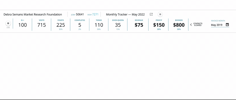
The place the design actually got decided was the job and group management view, the screen where a PM watched groups move through the field. We built it first, on purpose, because it was the hardest thing in the system, and solving it set the design language for everything that came after.
MY ROLE: UX Design, Interaction Design
Designing Data at Scale
The question that defined Edge was this: How do you show an overwhelming amount of live, conditional data so that someone can understand it at a glance, and then multiply that by ten and compare them just as fast?
The answer was the biggest design decision I made on the whole system, and it is deceptively simple to describe. Every job and group’s metrics were laid out horizontally, with the most critical information on the left. Because every job/group used the exact same layout, you could stack them and scan straight down a column, N value to N value, completes against completes, and read the health of an entire job or group in seconds. Consistency was not a nicety here, it was the whole mechanism. The moment two jobs or groups displayed their numbers in the same order, comparison was a natural result.
Within each job band, all of its groups were arranged in an accordion. Collapsed, it was a clean row of metrics displaying for each group, the summary view for scanning and comparing. Expanded, it opened into the deeper controls and inputs, the place you went to actually change a quota, adjust routing, or re-tune targeting. That one pattern, a metrics summary that opens into detailed controls, resolved the density-versus-clarity fight. The surface stayed scannable and comparable, and the complexity was always one click away, never in your face until you asked for it.
Getting that right first mattered more than any single screen, because it became the grammar of the entire platform. Every part of Edge built after it inherited the same logic: consistent, identifiable, aligned, progressively disclosed. I designed the hardest view first so everything downstream had a language to speak.
MY ROLE: UI/UX Design
Design Decisions That Mattered
A few principles came out of that work and held across the whole system.
Alignment is a feature. Lining every metric up in the same place, in the same order, on every job or group displayed turned raw data into something you could read by scanning, and made comparison instantly easy for the user. On a screen this dense, where a thing sits is as much a design decision as what it says.
Consistency so it could be taught. Edge came online in phases to a growing staff who had to be trained on it. A consistent, predictable design language was not just elegant, it was what made a tool this complex learnable at all.
Most critical to the left. The reading order was not arbitrary. The numbers a PM needed to catch a problem early sat where the eye lands first, so the screen answered “is anything wrong?” before you had to go looking.
Summary, then control. The accordion kept the day-to-day view calm and the deep controls close. You monitored in the collapsed state and operated in the expanded one, and you never had to leave the screen to move between them.
MY ROLE: Interaction Design, Design Systems
One Button, Every Action
Every job and every group could be acted on in a dozen ways. It could be edited, copied, annotated, inspected, priced, downloaded, have a new group added inside it, and more. Putting all of those controls on every row would have buried the metrics the row existed to show and wrecked the scannability the entire system depended on. Burying them a few screens deep would have made routine work slow. Neither answer was acceptable, and the tension between them is what this element solved.
I designed a single button, really a multi-button, on every job and every group. At rest it was quiet and nearly invisible, one small control that kept the row clean and let the metrics do the talking. On rollover it opened into a compact toolbar of actions, each one a labeled icon: edit, copy, notes, dates, preferences, download, view bid, add a group. The tasks a project manager did all day, like adding up a new group inside a job or duping the job, were now one hover away, without leaving the screen you were on or opening another tab.
The part I am proudest of is that I built it as a container, not a fixed menu. The toolbar contained slots that held components, so as Edge grew we could add a new action, retire one, or swap another without touching the row around it. A new capability in the platform became a new icon in the tray, in one place, everywhere, all at once. It was one pattern, learned once, that kept absorbing new functionality for years as the system evolved.
It is the clearest single example of the idea the whole platform was built on: keep the surface calm and keep the power one step away. It solved a hard density problem with one consistent, endlessly extensible control, and it is one of the biggest and most distinctive design contributions I made to the product.

MY ROLE: Product Outcome
What It All Added Up To
Edge became the core operating system of InnovateMR, and evolved quickly into handling many additional aspects of the company. By my third year, we had moved off third-party systems entirely and were running the business on our own platform. It saved the company a significant, ongoing expense. I never saw the exact figure, but replacing the paid third-party system was the entire point, and we did it. It scaled from a company of barely a dozen people into the system that a full staff of project managers, account managers, sales, and finance ran their days inside.
What I would take from it, and what I carry into complex systems now, is that the hard part of this kind of product is not fitting the data on the screen. It is deciding where every piece goes so a person can read it without thinking, and making that decision once, consistently, so it holds across a system far bigger than the first screen you draw. I designed the hardest view first, and it gave the whole platform a language.


MY ROLE: Product Design, Design Systems
From Internal Tool to Product
The clearest proof that Edge worked was what Matt and Gregg decided to do with it. The platform ran the business so well that they spun it off into a standalone product, Pegasus, and opened it up for other people to use.
Pegasus put the same platform in the hands of professional market researchers, so they could run their own studies, manage their own jobs, and operate the way our internal teams did every day. A system built to solve one company’s problem had become a product that other researchers paid to run their own work on. For an internal tool, there is no stronger validation than being told it is good enough to sell.
As Pegasus grew it kept adding and refining features for years, but the structure I had designed held the whole way through. The hierarchy of jobs and groups, the horizontally aligned metrics, the accordion that opened a summary into its controls, the single action button sitting on every row, all of it carried straight from the internal tool into the commercial product and stayed consistent as the system evolved. The real test of a design language is whether it survives growth, new users, and new demands it was never originally drawn for. This one did.
A structure built for a dozen people inside one company turned out to be the right foundation for a product sold to the whole industry.
Skills & Expertise
Product & UX Design
-
Enterprise and internal platform design
-
Complex, data-dense interface design
-
Information architecture for large systems
-
Workflow and task-flow design
-
End-to-end product design ownership
Interaction & Design Systems
-
Interaction design (accordions, rollover controls, inline editing)
-
Reusable, extensible UI components
-
A consistent design language across an entire platform
-
Progressive disclosure for scannable-at-scale screens
-
Designing for learnability and staff training
Research & Process
-
Stakeholder and operations interviews
-
Designing from real user workflows
-
Wireframing through to pixel-perfect comps
-
Photoshop
Leadership & Delivery
-
Directing a remote development team
-
Project management across phased builds
-
Translating founder concepts into shipped design